Web Design Trends 2026
The Art of Balance
Modern web design needs more expression — and more restraint. The balance is where the design becomes yours.
New visual trends are everywhere. But the most important design skill in 2026 may be knowing how much is enough.
01
Halftones, grain and texture
One of the most noticeable shifts in web design is the return of texture.
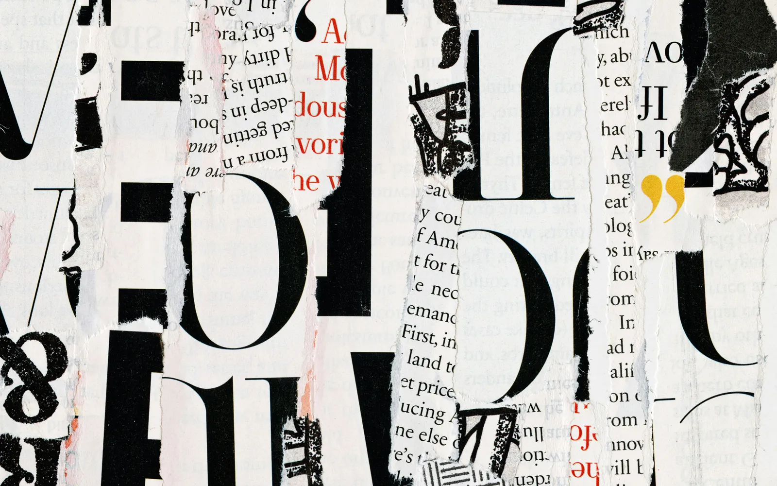
Halftones, grain, paper surfaces, imperfect gradients and subtle noise are appearing everywhere. After years of extremely clean interfaces, designers are introducing small imperfections that make digital spaces feel more physical.
A little grain can create atmosphere. A halftone pattern can add visual depth without introducing another photograph. A paper texture can give an interface a more editorial feeling.
But texture works best when it has a reason to exist.
Texture works best when you barely notice it — but immediately miss it when it is gone.
The difference is between atmosphere and decoration.
If every surface has noise, grain and patterns, the visual language quickly becomes exhausting. The strongest use of texture is often the quietest one.
A background can feel tactile without becoming the subject of the page.
02
ASCII and typography become visual objects
Typography is becoming more than information.
Oversized characters, ASCII compositions, distorted lettering, animated words and experimental type treatments are increasingly being used as visual elements in their own right.
The reason is simple: typography is lightweight.
A strong typographic composition can create a memorable visual moment without requiring a large photograph, illustration or complex asset.
This is especially useful for digital products where performance matters.
But expressive typography creates another responsibility: readability.
The best experimental typography still knows that someone has to read it.
A type treatment can be unusual without becoming difficult.
The most interesting examples usually create contrast between expressive display typography and extremely clear supporting text.
The result feels designed without sacrificing communication.
03
Flowing particles, waves and ripples
Another direction is movement that behaves more like physical material.
Particles, lines, waves, ripples and fluid shapes can react to scrolling, cursor movement or other interactions.
Instead of treating animation as a series of transitions between sections, these effects create a continuous sense of movement.
The page feels alive.
But interaction does not need to happen everywhere.
A cursor effect may look impressive in isolation, yet completely unnecessary on a website whose visual language has nothing to do with it.
The strongest interactions usually have a connection to the subject of the project.
A technology company might use flowing data-like particles.
A creative studio might use a more organic movement.
A cultural project might use something closer to film or print.
The effect becomes meaningful when it belongs to the visual idea.
04
Aurora, glass and pearlescent effects
Aurora gradients, translucent glass and pearlescent colour shifts continue to appear across digital design.
They are attractive for obvious reasons.
They create depth.
They create light.
They can make a simple interface feel dimensional without requiring complex illustrations.
The problem is that successful visual languages spread quickly.
Once enough websites use the same gradient, the same glass panels and the same blurred background, the technique starts to become invisible.
A trend becomes interesting again when you stop using it exactly as everyone else does.
The solution is not necessarily to avoid the trend.
It is to reinterpret it.
Change the colour relationships.
Change the composition.
Use the effect in an unexpected place.
Combine it with typography, photography or materials that create a different visual context.
The technology of the effect is rarely the interesting part.
The art direction is.
05
Motion: when movement helps
Motion has become one of the defining characteristics of premium digital experiences.
Scroll reveals.
Image transformations.
Text entrances.
Hover states.
Cursor interactions.
Transitions between sections.
When used carefully, motion creates hierarchy. It tells the visitor where to look and gives the interface a sense of rhythm.
But more animation does not automatically mean better design.
Every moving element asks for attention.
If everything moves, nothing has priority.
Motion should explain hierarchy, not compete with it.
A strong motion system therefore needs rules.
Some elements can enter quickly.
Others can move slowly.
Important moments can have more dramatic transitions.
Secondary elements can remain almost completely static.
The result is not an animated website.
It is a website with a sense of time.
06
Lottie and the rise of intelligent motion
Lottie has made sophisticated vector animation much easier to bring into websites and applications.
That opens the door to richer illustrations, animated icons, product demonstrations and branded microinteractions.
But the more interesting direction is not simply adding more animated assets.
It is treating animation as part of a system.
An illustration can respond to scrolling.
A character can react to interaction.
A diagram can reveal itself progressively.
A product interface can demonstrate behaviour rather than simply showing a screenshot.
In these cases, motion becomes part of the communication.
It is no longer decoration added after the design.
It becomes a design language.
07
The biggest trend might be human art direction
AI has made image generation, layout exploration and visual experimentation dramatically more accessible.
That changes the role of the designer.
The difficult part is increasingly not producing options.
It is deciding which option deserves to exist.
Anyone can generate ten hero images.
The valuable skill is recognising which one actually belongs to the project.
The same applies to colour palettes, typography, layouts and animation.
Tools can create possibilities.
They cannot automatically provide a point of view.
The more abundant the tools become, the more valuable taste becomes.
This is why art direction becomes increasingly important.
A strong project needs decisions.
What should be visible?
What should remain quiet?
What should be removed?
What should feel surprising?
What should feel familiar?
Those decisions create identity.
08
Templates are useful. But they are not a point of view.
Templates, design systems and component libraries are extremely useful.
They make projects faster.
They improve consistency.
They reduce unnecessary decisions.
But there is a difference between having a system and having a personality.
If a website looks exactly like the template it started from, the system becomes more visible than the brand.
The strongest projects use systems as a foundation.
Then they introduce decisions that belong specifically to the project.
A particular typographic rhythm.
A distinctive interaction.
A unique image treatment.
An unusual composition.
A specific relationship between space and content.
The system creates efficiency.
The art direction creates identity.
09
The real 2026 trend: balance
Looking at all of these directions together, a bigger pattern starts to appear.
The future of web design is not necessarily about adding more.
It is about knowing what deserves emphasis.
Expressive typography can work beautifully with a quiet grid.
A dramatic animation can work with a restrained interface.
A textured background can work with simple typography.
A highly visual hero can be followed by an extremely calm section.
The contrast creates personality.
The restraint gives that personality somewhere to breathe.
Expression gives a design character. Restraint gives it confidence.
The most memorable websites are rarely the ones where every possible technique is used.
They are the ones where every decision feels intentional.
10
The final thought
The tools are changing quickly.
The visual trends are changing quickly.
The techniques are becoming easier to access.
But the fundamental question remains the same:
Does this make the experience better?
Sometimes the answer is yes.
Sometimes the answer is no.
And sometimes the best design decision is to remove something that looked impressive five minutes earlier.
The final thought
Make it beautiful.
Make it useful.
Give it personality.
Leave enough space to breathe.
Maybe don't add one more animation.
Sometimes the most sophisticated effect is knowing when to stop.